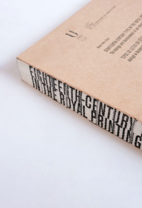
Eighteenth-century type in the royal printing office
The design and development of a historical interpretative revival
Adviser Maria Calado; Co-adviser John Downer
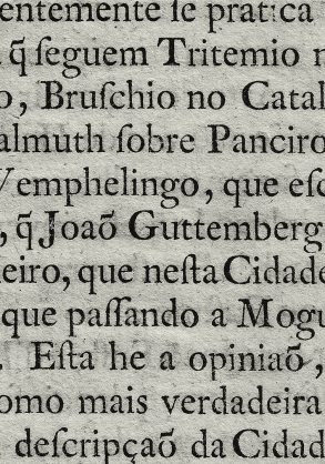
The thesis aimed to study and reinterpret the original Eighteenth-century characters from the Impressão Régia (Royal Press) Foundry. Additionally, based on research findings, a new typeface was developed. This thesis is a contribution to knowledge about the Eighteenth-century type history in Portugal. Last but not least it provides theoretical and practical experience on type design.
The discovery of the original punches developed by the Frenchman Jean Villeneuve, lead to the centre of the project. Other aspects beyond the punches by itself were taken into consideration, aiming for marked historical roots. Printed characters, the influence of calligraphy, the history of typography, and the surrounding context also part to substantiate each glyph’s design.
Regarding history, another typefounder, Henrique José Belinque – who was a contemporary of Villeneuve – was discovered. Both worked for the royal power following each other consecutively. The two typefounders’ work culminated in the Royal Press – Impressão Régia –, and they are the main individuals that created type used in Portugal at the time.
On the Revival
The project extends far from the historical investigation and contributes to knowledge exposing the steps followed on the design of a typeface. Methods are presented, and reasoning is detailed to support the typeface revival. Simultaneously forms a description of a practice based on an understanding of a piece of history that to a great extent still awaits depiction.
It is also intended to help create awareness of graphic design and typographic culture in Portugal. Hopefully, it can open the way to new research in typography and other typeface interpretations.
—
The thesis, originally written in English, it is currently being revised and translated to be published by the National Printing Office. A bilingual edition – Portuguese and English – it is expected by late 2019.
Together with Fábio Martins and Ricardo Dantas, at 0.itemzero he is also developing the free online glossary Design Words, as a tool to facilitate the understanding among desingers, print producers or other players related with design and printing.
Since 2016, teaches typography and type design at ESAD – School of Arts and Design in Matosinhos. Previously taught for about a decade at the ESAD.CR – Superior School of Art and Design of Caldas da Rainha, among other institutions as ESTAL – Escola Superior de Tecnologias e Artes de Lisboa, ETIC – School of Innovation and Training Technologies and ar.co – Center for Art and Visual Communication.
Works as a graphic designer developing books, custom and retail typefaces.
In 2004 he founded the graphic design studio 0.itemzero — internationally awarded —, collaborating with public and private entities in the field of culture, education, as well as renowned architects and the business community.
Since the late 1990s, he has been developing his letterpress workshop for typographical experimentation – the former Tipografia Dias(currently deactivated). From time to time workshops on traditional and experimental letterpress printing are performed, following a manifestation of interest of individuals or groups. Organised with Sofia Meira the event Hands-on Type at ESAD in Matosinhos, Portugal.
He has co-founded of the type foundry collective, Tipos das Letras, with Ricardo Santos, Aprígio Morgado and Ricardo Dantas. Its founding project is RUHA, a type family and a stencil ruler with different letter components that allow you to mix and match them to create a large variety of letters shapes.
2024 Blackletter Textura, Calligraphy Manuals, Co-Authored with João Varela, Fábio Duarte Martins, Ricardo Philippe Dantas, Published by Itemzero, Espinho.
2023 The Book Box, Co-Authored with Fábio Duarte Martins, Ricardo Philippe Dantas, Co-Published by Itemzero and Maiadouro, Espinho.
2021 The Book Cover / A Capa do Livro, Co-Authored with Rui Oliveira, Fábio Duarte Martins, Ricardo Philippe Dantas, Co-Published by Itemzero and Maiadouro, Espinho. [Bilingue edition Portuguese English]
2019 The Book Block / O Miolo do Livro, Co-Authored with Rui Oliveira, Fábio Duarte Martins, Ricardo Philippe Dantas, Co-Published by Itemzero and Maiadouro, Espinho. [Bilingue edition Portuguese English]
2025 “Saltério dos Desastrados”, Workshop de introdução à Letra Rotunda, com Pedro Amado (FBAUP/i2ADS), no âmbito da exposição REVELAÇÃO: Manuscritos Sagrados de Santa Cruz de Coimbra. Acervo: Biblioteca Pública Municipal do Porto. Curadoria: Rita Roque e Jorge Sobrado Consultor Científico: José Meirinhos. Alfândega do Porto.
2020 Type Design, with Fábio Duarte Martins (Scannerlicker), at Type Club, Escola Superior Media Artes e Design ESMAD, Vila do Conde.
2019 Modular Type Design – Experimenting modularity in type design, with Andreu Balius, Escola Superior de Artes e Design ESAD, Matosinhos.2018 RUHA with Super Veloz – stencil workshop, with Gamonal Arroyo, Escola Superior de Artes e Design ESAD, Matosinhos.
2018 Type Designwith Fábio Duarte Martins (Scannerlicker), at (warm-up to Type Club), Escola Superior Media Artes e Design.
2017 Letterpress basics workshop, Escola Superior de Artes e Design, Matosinhos.
2017 Letter Stencil RUHA, Escola Superior de Artes e Design, Matosinhos.
2016 Letterpress basics workshop, Escola Superior de Artes e Design, Matosinhos.
2016 RUHA Stencil Workshop, within 7th International Typography Meeting, “Rythmus”, [Encontro de Tipografia 2016]. Faculty of Architecture of the University of Lisbon, Lisboa.
2016/11/23 Movable Type Workshop, Tipografia Dias, Lisboa.
2016 Advanced Movable Type Workshop within 7th International Typography Meeting, “Rythmus”, [Encontro de Tipografia 2016], Tipografia Dias, Lisboa.
2015/12/20 Letterpress basics workshop, Tipografia Dias, no âmbito da Experimenta Design, Lisboa.
2015/12/13 Letterpress basics workshop, Tipografia Dias, no âmbito da Experimenta Design, Lisboa.
2015/12/12 Letterpress basics workshop, Tipografia Dias, no âmbito da Experimenta Design, Lisboa.
2015/11/21 Letterpress basics workshop, Tipografia Dias, within the paralel program of Experimenta Design, Lisboa.
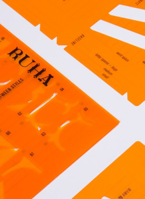
2015 Crossing Between Styles, Experimenta Design Biennale, Lisbon – with the Tipos das Letras collective.
2014 Ruha Stencil workshop, Grafill, Noruega. With the Tipos das Letras collective.
2013 Crossing Between Styles, Experimenta Design, Lisboa – With the Tipos das Letras collective.
2013 Letterpess Workshop for Illustration, Ar.Co – Centro de Arte e Comunicação Visual, Lisboa.
2013 Ruha workshop, 4th Typograhy Meeting [IV Encontro de Tipografia], Escola Superior de Artes Aplicadas do IPCB, Idanha a Nova – With the Tipos das Letras collective.
2013 Letra Real, Stencil Workshop, Comunicar Design X, Escola Superior de Artes e Design das Caldas da Rainha ESAD.CR – With the Tipos das Letras collective.
2012 Letterpess Workshop, Ar.Co – Centro de Arte e Comunicação Visual, Lisboa.
2007 Lettering Design, Universidade de Aveiro, com Ricardo Santos.
2006 Design your type, Instituto de Artes Visuais, Design e Marketing, Lisboa, with Ricardo Santos.
2005 Type Big, Small Type, Instituto de Artes Visuais, Design e Marketing, Lisboa, with Ricardo Santos.
2022 Annotation protocols. Context and operational concepts of the note paratext in books for extended reading co-authored with Ricardo Dantas, Pedro Amado and Fábio Martins, presented at 12º Typography Meeting, Universidade da Beira Interior, Covilhã.
2022 Image Filter Tests in Type Design, Optics: a review, co authored with Fábio Martins and Carlos Rosa, presented at 12º Typography Meeting, Universidade da Beira Interior, Covilhã.
2022 Hands—on Type, Learning from letterpress heritage, co-authored wth Sofia Meira, presented at 12º Typography Meeting, Universidade da Beira Interior, Covilhã.
2022 Context and Operational Concepts of Running Titles in Books for Extended Reading, with Ricardo Dantas, Pedro Amado e Fábio Martins.DIGICOM 2022.
2022 Context and morphology of the body-text page model in books for extended reading, IJUPUniversidade do Porto.
2022 We thrive in book tailoring and type crafting. We love it.Artec 32, Much More Than That – Simpósio das Artes Gráficas, Instituto Politécnico de Tomar
2019 Ferramentas de utilização para tipos de letra dinâmicos, co-authored with Ana Fernandes, presented and published at X Encontro de Tipografia, Escola Superior de Artes e Design – ESAD, Matosinhos.
2019 The Fiapo book and open talk with ItemZero (Rúben Dias and Ricardo Dantas), Márcia Novais, Mário Moura and Rui Vitorino Santos, Faculty of Fine Arts of Oporto Univerisity.
2019 From Type from eighteenth-century to a digital typeface, Porto Letterheads, ESAD, Escola Superior de Artes e Design, Matosinhos.
2017 From Metal to Beziers, the redesign of an eighteenth-century typeface [Do metal aos beziers, o redesign do um tipo de letra do século XVIII], Escola Superior de Artes e Design – ESAD, Matosinhos.
2013 Type Design – from punches to digital, in: “Do escrito ao inscrito” 4th Typograhy Meeting [IV Encontro de Tipografia], Escola Superior de Artes Aplicadas, Instituto Politécnico de Castelo Branco, Idanha a Nova.
2012 A letra de imprensa na Academia Real da História Portuguesa na primeira metade do século XVIII, in: 3th Typography Meeting [III Encontro de Tipografia], Escola Superior de Música, Artes e Espectáculo – Instituto Politécnico do Porto.
2012 Uma perspectiva sobre letras escrita e caligrafia / lettering / tipos de letra e tipografia; co-authored with Ana Félix, in: 3th Typography Meeting [III Encontro de Tipografia], Escola Superior de Música, Artes e Espectáculo – Instituto Politécnico do Porto.
2011 O lugar da tipografia na arquitetura: Contributo para a salvaguarda e construção de memória. Co-Authored with Joana Lessa; Paulo T. Silva; Ricardo Santos; Luís Ferreira; Manuel da Silva Lessa, in: 2nd Typography Meeting, (Segundo Encontro de Tipografia), Aveiro University.
2010 O ensino da tipografia na ESAD.CR – programa metodológico, in: First Typography Meeting [Encontro de Tipografia], Escola Superior de Artes e Design ESAD.CR, Caldas da Rainha.
2009 O Design como objecto de comunicação na Arquitectura, in: Arquitectura e Publicação, Instrumentos e meios de publicação, Nucleo de Arquitectura da Universidade Lusíada, Lisboa.
2008 Os tipos das letras, um colectivo tipográfico, Aveiro University (Co-authored with Ricardo Santos).
2006 Novas tendencias na tipografia digital – Lisboa Open Type, in: XVI ARTEC – Simpósio das Artes Gráficas – ®evolução digital, Instituto Politécnico de Tomar.
2006 Oban, do desenho ao uso, in: Conferências CPDC’06, Faculdade de Belas Artes da Universidade de Lisboa2005 Oban, o processo de um tipo de letra, in: XV ARTEC – Simpósio das Artes Gráficas, Instituto Politécnico de Tomar.
2024 Annotation protocols. Context and operational concepts of the note paratext in books for extended reading co-authored with Ricardo Dantas, Pedro Amado and Fábio Martins, Proceedings book “Matter of type”, 12º Typography Meeting, Universidade da Beira Interior, Covilhã.
2024 Image Filter Tests in Type Design, Optics: a review, co authored with Fábio Martins and Carlos Rosa, Proceedings book “Matter of type”, 12º Typography Meeting, Universidade da Beira Interior, Covilhã.
2024 Hands—on Type, Learning from letterpress heritage, co-authored wth Sofia Meira, Proceedings book “Matter of type”, 12º Typography Meeting, Universidade da Beira Interior, Covilhã.
2022 “Context and Operational Concepts of Running Titles in Books for Extended Reading”, with Ricardo Dantas, Pedro Amado e Fábio Martins. In: Martins, N., Brandão, D. (eds) Advances in Design and Digital Communication III. DIGICOM 2022. Springer Series in Design and Innovation , vol 27. Springer, Cham. link.
2022 ”Ferramentas de utilização para tipos de letra dinâmicos”, com Ana Fernandes, pp.137-161. In 10º Encontro de Tipografia — Livro de Actas, Margarida Azevedo, João Lemos, Rúben R. Dias, Sofia Meira (eds.). Investigação em Arte e Design ESAD–IDEA and ATIPO Associação Tipográfica Portugesa.
2016 “RUHA – Modern Fine Characters Crossing Between Styles”, Burilada, Investigação em Arte e Design ESAD–IDEA, Matosinhos City Council, Matosinhos.
2015 “Tipos”, in Desejo Tensão e Transição, Investigação em Arte e Design ESAD–IDEA, Matosinhos City Council e design, Experimenta Design 15, Matosinhos.
Participation on scientific comities with blind peer reviewers
2025 ”Typographicology”, 15º Typography Meeting, ESMAD/P.PORTO, Vila do Conde, Póvoa de Varzim
2025 Polarities, Limits and Thresholds, Arts and Culture, under publication consideration by DAC Design | Arts | Culture Journal (5th Issue, No. 1, 2024). Esad–Arte e Design, Matosinhos.
2024 Polarities, Limits and Thresholds 2, Arts and Culture, under publication consideration by DAC Design | Arts | Culture Journal (5th Issue, No. 1, 2025). Esad–Arte e Design, Matosinhos.
2017 “Multicultural”, 8th Typography Meeting [Oitavo Encontro de Tipografia], Universidade do Algarve.
2016 “Rythmus”, 7th Typography Meeting [Sétimo Encontro de Tipografia], Faculdade de Arquitectura da Universidade de Lisboa.
2015 “Perceção”, 6th Typography Meeting, [Sexto Encontro de Tipografia], Universidade de Aveiro.
2014 “Ubíqua”, 5th Typography Meeting, [Quinto Encontro de Tipografia] Instituto Politécno do Vale do Cávado e do Ave.
2013 “Do inscrito ao escrito”, 4th Typography Meeting [Quarto Encontro de Tipografia], Instituto Poltécnico de Castelo Branco.
2012 “Convergências”, 3th Typography Meeting [Terceiro Encontro de Tipografia], Escola Superior de Música, Artes e Espectáculo e o Instituto Politécnico do Porto.
2011 “Contextos de Investigação e de Aplicação”, 2nd Typography Meeting [Segundo Encontro de Tipografia], Universidade de Aveiro.
Conferences and workshops organization
2025 Design for Digital Reading, organisation: IPCA; PXL/Readsearch, PJAIT, in Hasselt, Belgium
2020 SuperVeloz Workshop of Andreu Balius (TypeRepublic / EINA) & Roberto Gamonal (Familia Plómez / UCM (coodination of Rúben R. Dias and Sofia Meira) at ESAD Printing Workshop
2019 “Borders”, X Typography International Meeting [Décimo Encontro Internacional de Tipografia], with peer review, Escola Superior de Arte e Design ESAD, Matosinhos.
2010 O ensino da tipografia em Portugal, Primeiro encontro Nacional de Tipografia, Escola Superior de Arte e Design das Caldas da Rainha/Instituto Politécnico de Leiria ESAD.CR, Caldas da Rainha.
2000 – […] develops his own letterpress workshop Tipografia Dias.
1998-2003 worked as an internship, designer or freelancer for a myriad of agencies, design studios and printing offices as Methodus Design, Coyote Designers, Experimenta Design, Gráfica de Leiria, Leirisic, Publicenso.
Published Typefaces
2013 RUHA OpenType®, with Tipos das Letras, available at Myfonts.
2012– 2015 Teacher and coordinator of the Letterpress Workshop, at Ar.co – Centro de Arte e Comunicação Visual, Lisboa
2012 – 2013 Teacher of Typography, ESTAL, Lisboa
2006 – 2009 Teacher of Type Design, at Ar.co – Centro de Arte e Comunicação Visual
Master and PhD coordination
2023 – 2025 Do artesanato à tipografia O bordado de Viana do Castelo como ornamento tipográfico, Dania Amorim, Mestrado em Design de Comunicação, Escola Superior de Artes e Design ESAD, Matosinhos.
2022 – … Recuperar, Re-interpretar e Readaptar a Tipografia com Caracteres móveis no ensino de Design [Gráfico]: um caso de estudo no contexto Português, Sofia Meia, Doutoramento em Design, Faculdade de Belas Artes da Universidade do Porto.
2022 – … Over inked, under inked, explorações tipográficas com caracteres móveis, Susana Barbosa, Mestrado em Design de Comunicação, Escola Superior de Artes e Design ESAD, Matosinhos.
2022 – … Exploração de sistemas de escrita aplicados ao entretenimento audiovisual, Rita Ribeiro, Mestrado em Design de Comunicação, Escola Superior de Artes e Design ESAD, Matosinhos.
2021 – … Book design protocols: context and operational concepts of the body text page paratexts in books for extended reading, Master of Graphic Design and Editorial Projects, Faculdade de Belas Artes da Universidade do Porto.
2021 – … Tipografia Armazém: Um resgate tipográfico dos letterings pintados à mão encontrados no Porto durante a década de 1960 , Raphael Santana Sathler, Escola Superior de Artes e Design ESAD, Matosinhos.
2019 – … A influência dos tipos de madeira no desenho de novas fontes. Carlos Oliveira, Escola Superior de Artes e Design ESAD, Matosinhos.
2018-2019 Parametric Design/Design paramétrico, Ana Fernandes, em co-orientação de Maria João Baltazar, Escola Superior de Artes e Design ESAD, Matosinhos.
2025 Do artesanato à tipografia O bordado de Viana do Castelo como ornamento tipográfico, Dania Amorim, Mestrado em Design de Comunicação, Escola Superior de Artes e Design ESAD, Matosinhos.
2020 A influência do traçado caligráfico no design de tipos de letra, Desenvolvimento da Figurat, um tipo de letra contemporâneo não serifado com contraste, Abel Martins, Design Master at FBAUL – Faculdade de Belas Artes da Universidade do Porto.
2018 A arte do título: O título feito à mão na capa de livro, Fabio Burst, IPT – Master at Instituto Politécnico de Tomar.
2018 Tipos na Web, Lisa Resende, Master at IPT – Instituto Politécnico de Tomar.
2016 Formatos dos jornais, Transformações; Análise e proposta gráfica ao jornal impresso e o futuro do seu formato (redesign do jornal i), Master at Tânia Forreta, Escola Superior de Arte e Design do Instituto Politécnico de Leiria ESAD.CR, Caldas da Rainha.
2016 The Logo in the heavy metal culture, understanding and registration of existing codes and visual paterns, Marco Alexandre, Master at Escola Superior de Arte e Design do Instituto Politécnico de Leiria ESAD.CR, Caldas da Rainha.
2016-2017 Tipografia Dias uma colecção de Workshops, 7th Typography Meeting [Sétimo Encontro Internacional de Tipografia], Faculdade de Arquitectura da Universidade de Lisboa.
2016 Ruha Stencil workshop, 7th Typography Meeting [Sétimo Encontro Internacional de Tipografia], Faculdade de Arquitectura da Universidade de Lisboa – With the collective Tipos das Letras.
2016 Letra D at LAWM – Letters are what matters, Silos Contentor Criativo das Caldas da Rainha – With the collective Tipos das Letras.
2016 “RUHA – Modern FIne Characters Crossing Between Styles”, at Burilada, Câmara Municipal de Matosinhos; esad–idea Investigação em arte e design – With the collective Tipos das Letras.
2016 Letra G (Tipografia Dias) at LAWM – Letters are what matters, Silos Contentor Criativo das Caldas da Rainha.
2016 Letra X at LAWM – Letters are what matters, Silos Contentor Criativo das Caldas da Rainha.
2016 Tipografia Dias, Open Day – Lola Mullen Lowe, Lisboa.
2015 Tipos, in Desejo Tensão e Transição, Câmara Municipa de Matosinhos; esad–idea Investigação em arte e design, Experimenta Design 15.
2014 Ruha Stencil workshop, Bergen Book Art Fair, Bergen, Noruega – With the collective Tipos das Letras.
2013 Letra Real, Stencil Workshop, Comunicar Design X, Escola Superior de Artes e Design das Caldas da Rainha ESAD.CR – With the collective Tipos das Letras.
2006 Oban Type Family, Jornadas Atypicas, Faculdade de Belas Artes de Lisboa.
2005 TransitRäume – Fundação Bauhaus, em Bordeaux, França.
2004 Transit Spaces, 1.ª Bienal Internacional Chinesa de Arquitectura, Beijing. TransitRäume – Fundação Bauhaus.
2004 Oban Typeface, Festival of Video – Armenian Center for Contemporay Experimental Art – ACCEA, Arménia.
2025 20th best of list in Book Design Award by the National Council of Book and Libraries [Prémio Design do Livro, by DGLAB Direcção Geral do Livro e das Bibliotecas], Book design of Paper, Paper, Paper.
2025 Bronze Cube – ADC: Book Design, Text & Image-Driven Books — Paper, Paper, Paper.
2022 The Book Cover – 20th best of list in Book Design Award by the National Council of Book and Libraries [Prémio Design do Livro, by DGLAB Direcção Geral do Livro e das Bibliotecas].
2021 ADCE Awards, European Star Winner — Book Design Award, The Book Cover, Industrial Bookbinding techniques.
2021 Bolonha Children Book Fair in the category of non fiction attributed it a special mention to Tipos Curiosos, Pequena História das Letras [Curious Types, a small history of letters], among 1577 books, from 41 países.
2020 ADCE Awards, Editorial Design Nomination — The Book Block, Industrial Bookbinding techniques.
2020 Clube de Criativos Silver Design Editorial — The Book Block, Industrial Bookbinding techniques.
2020 ADC Awards, Publication Design — The Book Block, Industrial Bookbinding techniques.
2020 Novum Design Award, Gold in Digital Art and Graphic Design Category — The Book Block, Industrial Bookbinding techniques.
2019 Fiapo – Shortlisted in “Best Book Design from all over the World” International competition Stiftung Buchkunst for the 2019.
2018 Fiapo – Honorary Mention in Book Design Award by the National Council of Book and Libraries [Prémio Design do Livro, by DGLAB Direcção Geral do Livro e das Bibliotecas].
2017 Award of Typographic Excellence of Type Director’s Club with the book Manual Prático do Tipógrafo, – with Clube dos Tipos.
Advances in Design and Digital Communication III (DIGICOM 2022)
2022
Context and Operational Concepts of Running Titles in Books for Extended Reading
Books are objects made up of a structure rich in details and hierarchies of information that exceed the main body-text of the literary work. Those pieces of information, named paratexts, can be of pragmatic, semantic, and aesthetic-literary nature, and contribute to the editorial object as to the reading of its content. Within the scope of editorial design, the study of paratexts reveals several shortcomings in their morphological definition, as well as the need for synthesis and contextualization. In this article, we address these issues by using one of these paratexts as a case study: the running title of books for extensive reading. This article intends to make a historical contextualization and definition of these elements. Afterward, we expand on further critical analysis of the running title in the context of the page model of the main body-text. Through literature review and adapting its historical context to its current use, we propose to compile it from a meta-analysis methodology into a morphological compendium.
10th TYPOGRAPHY MEETING / 10º ENCONTRO DE TIPOGRAFIA
2022
Levantamento do estado da arte e propostas para utilização de tipos de letra dinâmicos
[Survey of the state of the art and proposals for the usage of dinamic type]
Co-authored with Ana Fernandes
This research main objective was to contribute to the identification of methods and processes that establish the use of parametric and variable sources. Comprises a survey of the state of the art for dynamic fonts divided into two aspects. The first focuses on the parameters that are currently being given to the user to manipulate, either through parametric font applications or in variable font formats. In this way, the collected parameters of two applications that currently allow changing parametric sources — Metaflop and Prototypo — and to survey the variation parameters of two hundred variable sources, with the aim of trying to understand what they are and in how they occour. In a second aspect, the tools or forms of interaction currently available for manipulating this sources were collected, organized and analyzed. Having been collected from the most diverse sources of information, from theories, web pages that focus on experimentation in text formatting, automation possibilities, among others, was organized from the point of view of interaction analysis . The objective was to understand potentialities and patterns that can be used and/or adapted for future uses. Finally, two proposals are introduced that seek to establish a mediation between the typographer's knowledge and the user's experience.
Post-Digital Letterpress Printing – Research, Education and Practice
2021
The Role of the Letterpress Workshop
Co-authored with Sofia Meira
Collected notes on the implementation of a contemporary letterpress workshop inside the Academia. You ca find this article at Routledge.
Cidade gráfica, letreiros e reclames Lisboa no século XX [Graphic city, letter signs in Lisbon's twentieth-century]
2017
Letras que Habitam a Cidade
[Letters Inhabiting the City]
A bilingual, Portuguese and English, book on shop signs from Lisbon, Edited in 2017 reveals part of the collection developed by Rita Múrias e Paulo Barata that keeps growing and worth a visit. You can find out more about their project Letreiro Galeria troug their Instagram.
The article included in this book presents, a brief look on the shapes that where once part of the city, and unfortunately tend to disappear.
Views on Eighteenth Century Culture: Design, Books and Ideas
2015
Henrique José Belinque (flor. 1755-1762) Portuguese Typefounder
This Article is a resume of Herique José Belinque, a typefounder in Lisbon that was called from the Royal Power to implement the first public school of type. The article is in English only.
Edited by Cambridge Scholar Publishing, as the result of the International Conferences on the Eighteenth Century Architecture and Culture, Organised by FA-UL and FCSH, held at Fundação Calouste Gulbenkian in Lisbon, by November 23th–25th, 2011. You can find the full book here.
Design Português, 1900/1919 · Madalena Souto
2015
Typographia do Annuário Commercial
Short note on a booklet of the Typographia do Annuário Comercial a workshop based in the hearth of Lisbon, during the early twenty first century, producing high quality books.
This book is part of a collection edited by Verso da História and ESAD, distributed by the national daily newspaper Publico, coordinated by José Bartolo, edited only in Portuguese. You can find the full collection here.
4th TYPOGRAPHY MEETING / 4º ENCONTRO DE TIPOGRAFIA
2013.11.26-29
Corpos dos tipos
[Type body sizes]
Co-authored with Francisca Monteiro
An article in a poster format that records from a myriad of documents the Portuguese nomenclatures used to designate the type sizes used before the Didot Point – that emerged in the late eighteenth century. It is presented a comparative table gathering the terminologies used from the eighteenth up to the twenty-first century revealing the wide variation in name’s usage, that show the influences from all over Europe.
The same table is a proposal of an organisation and an approximation of these nomenclatures to the Didot point sizes, to order it's terminology usage for further researchers.
The full article is available (Portuguese only) in the 4th Typography Meeting's Book of Proceedings, Page 142, or at Academia.
3th TYPOGRAPHY MEETING / 3º ENCONTRO DE TIPOGRAFIA
2012.10.08-09
Uma perspectiva sobre letras, escrita e caligrafia / lettering / tipos de letra e tipografia.
[One perspective about letters, writting, and calligraphy / lettering / typefaces and typography]
Co-authored with Ana Sofia Félix
Similar to other knowledge areas, Typography has been developing a language and specific terminology. With the progress of education in typography, it becomes essential to establish and comprehend the concepts used in the profession.
A few of these concepts are still to be settled, particularly in the Portuguese language. The ones about the way work and talk about letters, as the writing, calligraphy, lettering or other drawn letters and the typography or typefaces are being misused either on-line and even in academic contexts.
This article aims to propose to the discussion a way of understanding for each one of them, not as an absolute way, but by presenting their proceedings, peculiarities, objectives and limits.
The full article is available (Portuguese only) in the III Typography Meeting's, Book of Proceedings, pp.62-71;
3th TYPOGRAPHY MEETING / 3º ENCONTRO DE TIPOGRAFIA
2012.10.08-09
A letra de Imprensa na Academia Real da História Portuguesa na primeira metade do Século XVIII.
[Printing type in the Royal Academy of Portuguese History during the first half of the eighteenth-century]
The full article is available (Portuguese only) in the III Typography Meeting's, Book of Proceedings, pp.102-115;
Cidade Gráfica, Letreiros e Reclames Lisboa no século XX
2017
Letras que Habitam a Cidade
Letters Inhabiting the City
A bilingual, Portuguese and English, book on shop signs from Lisbon, Edited in 2017 reveals part of the collection developed by Rita Múrias e Paulo Barata that keeps growing and worth a visit. You can find out more about their project Letreiro Galeria troug their Instagram.
The article included in this book presents, a brief look on the shapes that where once part of the city, and unfortunately tend to disappear.
Views on Eighteenth Century Culture: Design, Books and Ideas
2015
Henrique José Belinque (flor. 1755-1762) Portuguese Typefounder
This Article is a resume of Herique José Belinque, a typefounder in Lisbon that was called from the Royal Power to implement the first public school of type. The article is in English only.
Edited by Cambridge Scholar Publishing, as the result of the International Conferences on the Eighteenth Century Architecture and Culture, Organised by FA-UL and FCSH, held at Fundação Calouste Gulbenkian in Lisbon, by November 23th–25th, 2011. You can find the full book here.
Design Português, 1900/1919 · Madalena Souto
2015
Typographia do Annuário Commercial
Short note on a booklet of the Typographia do Annuário Comercial a workshop based in the hearth of Lisbon, during the early twenty first century, producing high quality books.
This book is part of a collection edited by Verso da História and ESAD, distributed by the national daily newspaper Publico, coordinated by José Bartolo, edited only in Portuguese. You can find the full collection here.
4th TYPOGRAPHY MEETING / 4º ENCONTRO DE TIPOGRAFIA
2013.11.26-29
Corpos dos tipos
[Type body sizes]
Co-authored with Francisca Monteiro
An article in a poster format that records from a myriad of documents the Portuguese nomenclatures used to designate the type sizes used before the Didot Point – that emerged in the late eighteenth century. It is presented a comparative table gathering the terminologies used from the eighteenth up to the twenty-first century revealing the wide variation in name’s usage, that show the influences from all over Europe.
The same table is a proposal of an organisation and an approximation of these nomenclatures to the Didot point sizes, to order it's terminology usage for further researchers.
The full article is available (Portuguese only) in the 4th Typography Meeting's Book of Proceedings, Page 142, or at Academia.
3th TYPOGRAPHY MEETING / 3º ENCONTRO DE TIPOGRAFIA
2012.10.08-09
Uma perspectiva sobre letras, escrita e caligrafia / lettering / tipos de letra e tipografia.
[One perspective about letters, writting, and calligraphy / lettering / typefaces and typography]
Co-authored with Ana Sofia Félix
Similar to other knowledge areas, Typography has been developing a language and specific terminology. With the progress of education in typography, it becomes essential to establish and comprehend the concepts used in the profession.
A few of these concepts are still to be settled, particularly in the Portuguese language. The ones about the way work and talk about letters, as the writing, calligraphy, lettering or other drawn letters and the typography or typefaces are being misused either on-line and even in academic contexts.
This article aims to propose to the discussion a way of understanding for each one of them, not as an absolute way, but by presenting their proceedings, peculiarities, objectives and limits.
The full article is available (Portuguese only) in the III Typography Meeting's, Book of Proceedings, pp.62-71;
3th TYPOGRAPHY MEETING / 3º ENCONTRO DE TIPOGRAFIA
2012.10.08-09
A letra de Imprensa na Academia Real da História Portuguesa na primeira metade do Século XVIII.
[Printing type in the Royal Academy of Portuguese History during the first half of the eighteenth-century]
The full article is available (Portuguese only) in the III Typography Meeting's, Book of Proceedings, pp.102-115;
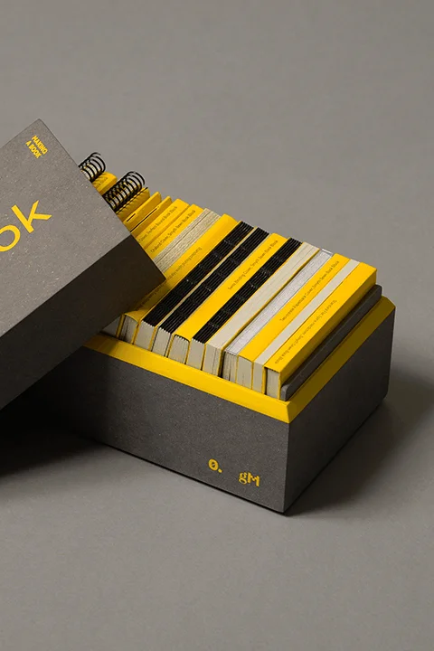
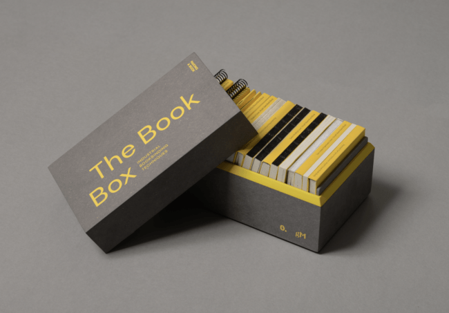
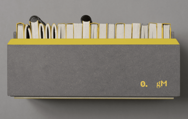
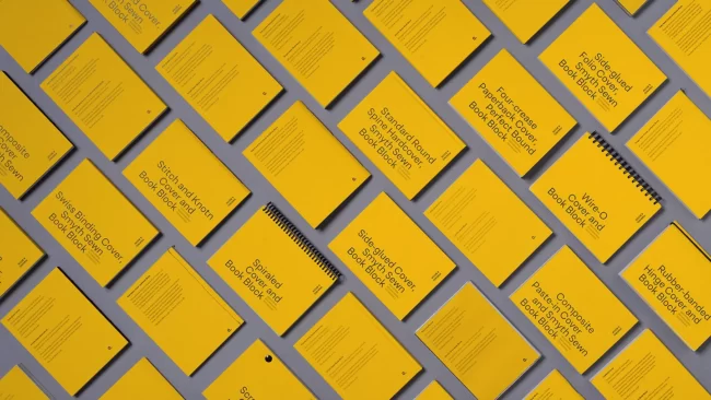
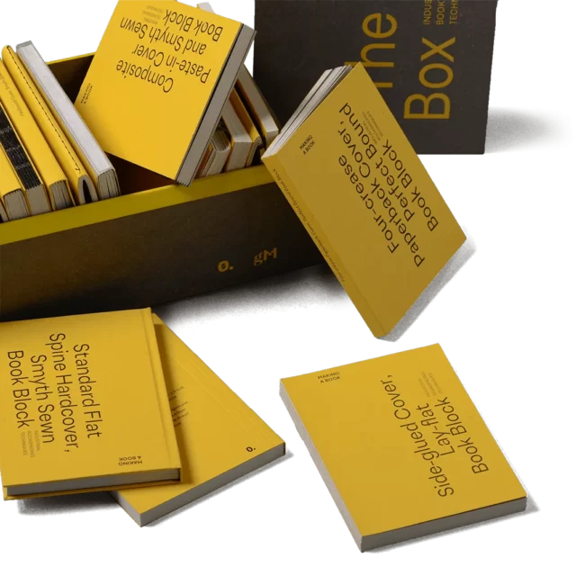
The Book Box is available exclusively at the o.itemzero website BUY HERE
Published by o.itemzero
2023
The Book Box
Industrial Bookbinding Techniques
Co-autored with Rui Oliveira, Fábio Martins, Ricardo Dantas
Industrial bookbinding kit developed to brainstorm, troubleshoot, and impress. Contains 20 beautifully designed books, showcasing the essential bookbinding techniques, covers, and finishes. Each book provides technical specifications of its production, ideal for educational and professional purposes. Perfect for designers, graphic artists, educators, and anyone who works with bookbinding.
With The Book Box, you will have the ultimate tool to impress your clients, inspire your team, and educate your students. The sleek and stylish box makes it easy to take with you wherever you go, and the detailed specifications on each book will allow you to communicate your ideas clearly with print houses.
A limited edition was produced, with the highest quality in craftsmanship requires painstaking attention to detail.
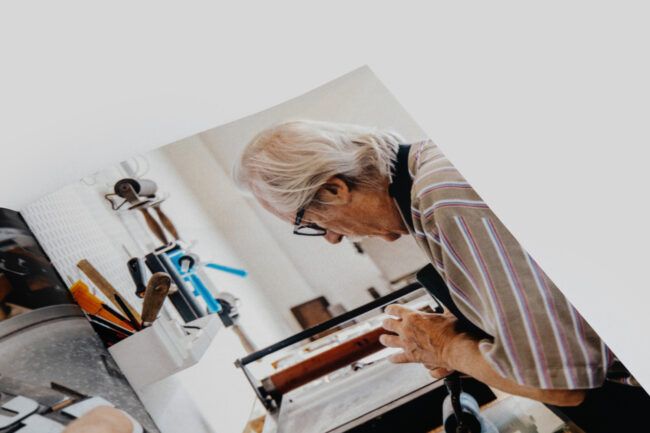
The historical influence of letterpress and movable type in the discipline of Graphic and Communication Design is indisputable and even today, in the midst of the digital age, the ability to master hundreds of years-old typographic techniques allows us to broaden horizons and create innovative solutions to contemporary issues.
This book proposes a "return to the past" to recover and re-contextualize typographic printing without, however, abandoning the perspective of renewal of Design and its practices.
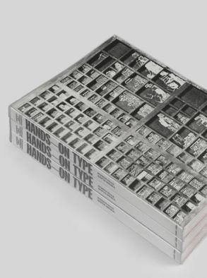
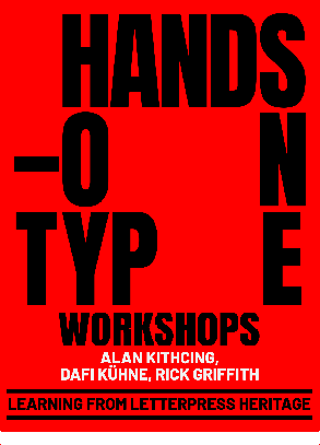
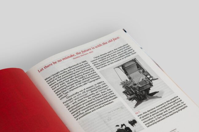
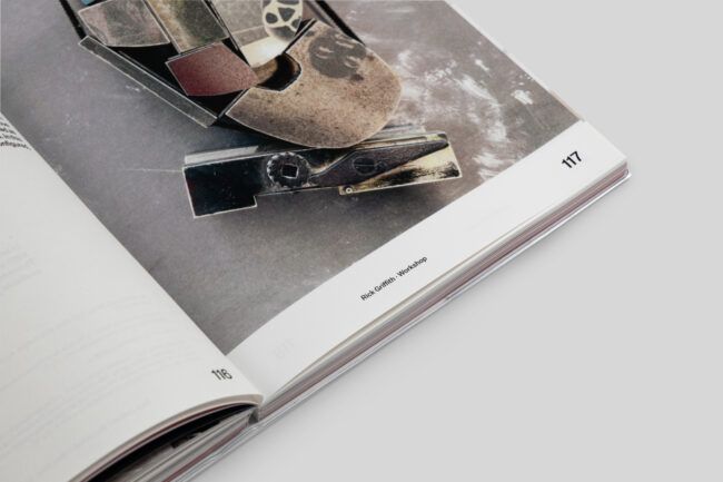
As result from a three days workshop and a conference held at ESAD it includes interviews with Alan Kitching, Dafi Kühne and Rick Griffith, images and final results from each workshop plus three articles on letterpress history and design education
This book was developed with Sofia Meira at esad with the support of DGArtes, for the event with the same name.
Photography by esad
Texts Rúben Dias, Sofia Meira,João Bicker, Erin Beckloff, Catarina Silva, Pedro Amado, Vítor Quelhas
Art direction and graphic design Pedro Meireis, Diogo Oliveira
160x235mm 220 pages Paperback PT + EN 978-989-53183-7-7
This book is available at the itemzero website BUY HERE
Published by 0.Itemzero
2022
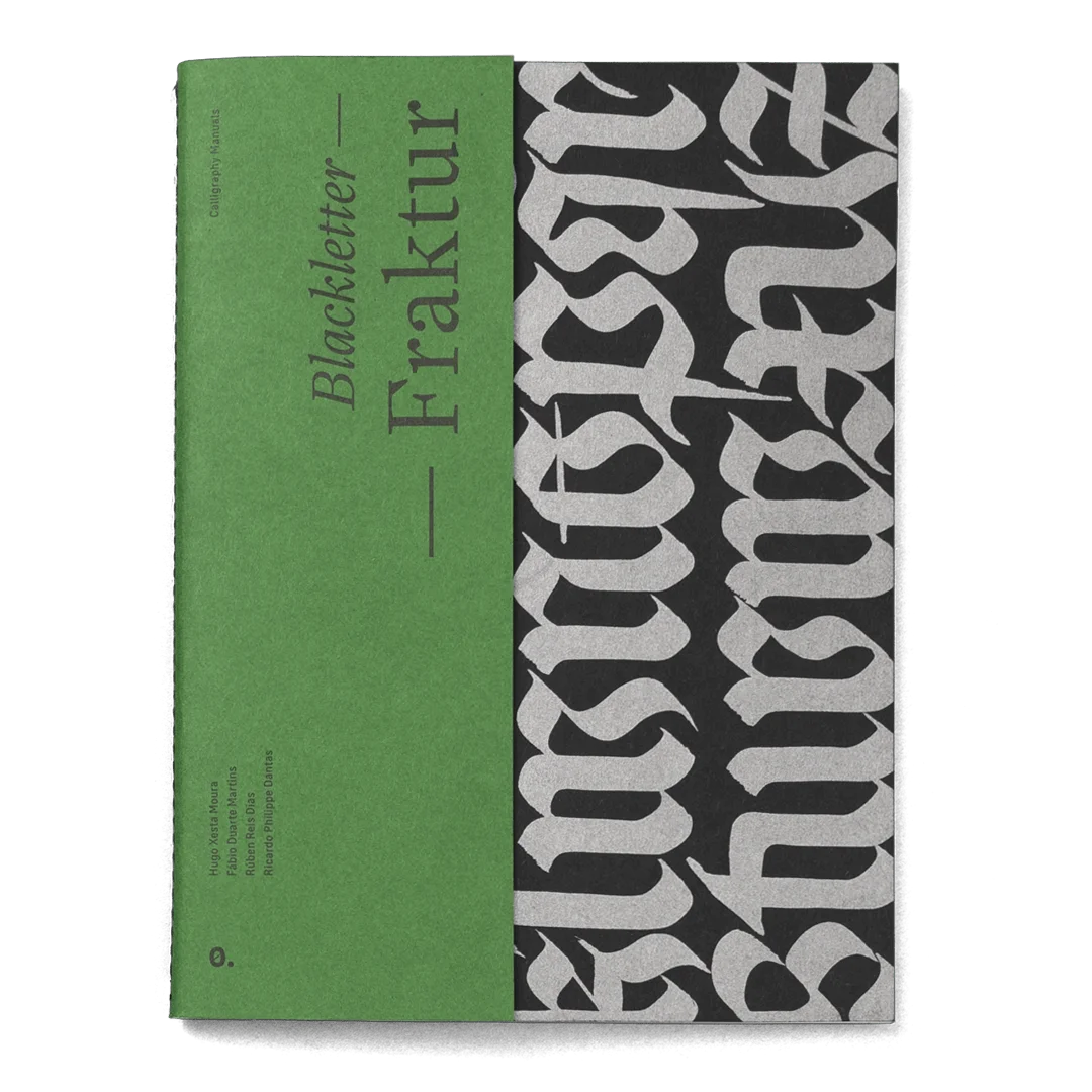
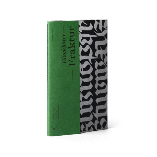
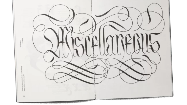
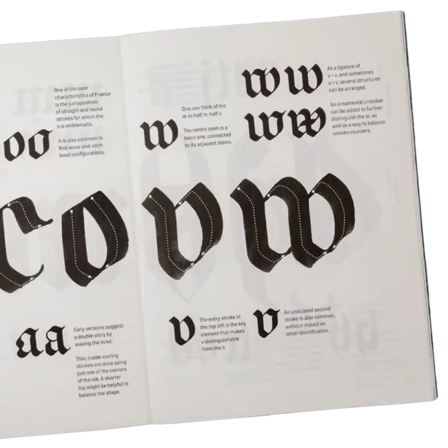
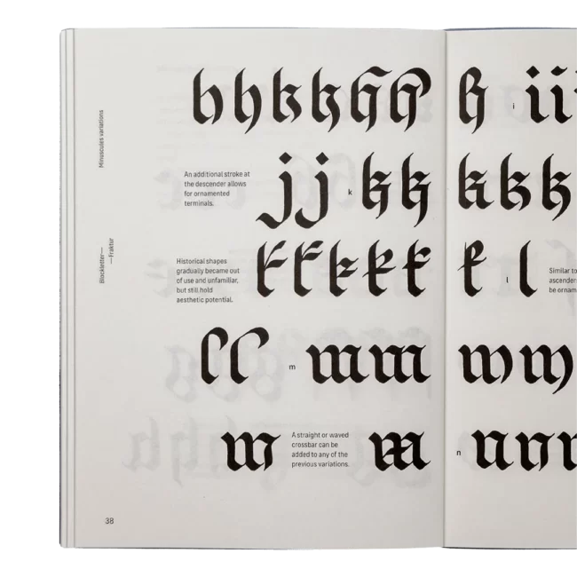
Blackletter — Fraktur
Calligraphy Manuals
Co-authored with Hugo Xesta Moura, Fábio Martins, and Ricardo Dantas
A calligraphy book. A guide to Blackletter Fraktur. From tools to letter shapes, it covers the full spectrum of this script and goes all the way through to advanced letter construction.
Highly illustrated, and packed with historical and contemporary variations. Includes 680+ handmade illustrations for the Fraktur alphabet. The approach of the book breaks down complex concepts into easy-to-understand terms so that you can learn Fraktur from the very beginning.
This book is available at the itemzero website BUY HERE
Co-Published by Itemzero and Maiadouro
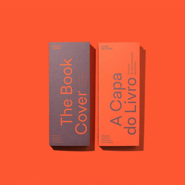
2021
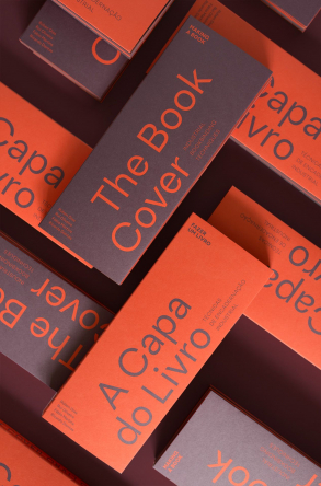
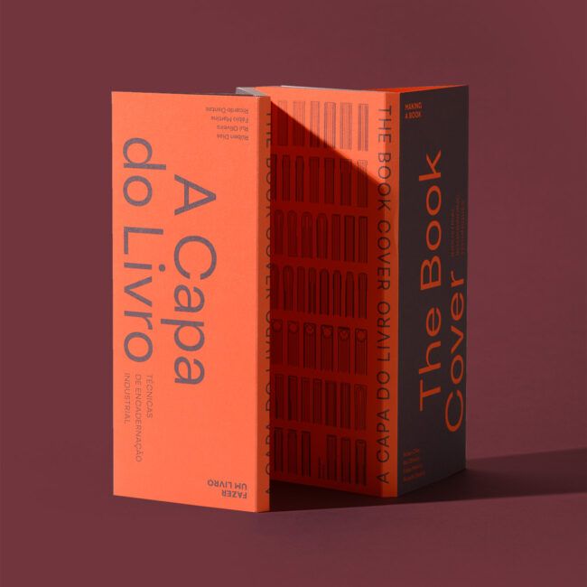
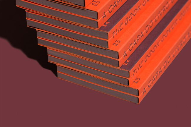
The Book Cover [A Capa do Livro]
Industrial Bookbinding Techniques [Técnicas de Encadernação Industrial]
Co-authored with Rui Oliveira, Fábio Duarte Martins and Ricardo Philippe Dantas
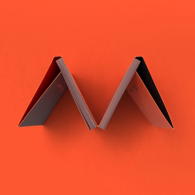
This book gathers the most common industrial bookbinding techniques. As a partner to The Book Block, presents how books are made, its characteristics and considerations, that may be helpful to consider when ordering, designing or producing the cover of a book. Therefore it is directed to editors, designers and producers related to the book arts.
Thoroughly illustrated, allow a fast access to the multiple concepts for each technique. Therefore as a bilingual edition in Portuguese and english establish for the first time a vocabulary for Portuguese language.
Resulting from partnership of the design studio Itemzero and the book printers and bookbinders Maiadouro it was developed in eight hands, containing the knowledge from the practice of design and production. As a result gathers in a concise and direct language the keen yes of a book designer and the practical experience of a contemporary industrial bookbinder.
AWARDS: — CCP, Publication Design, 2021, SILVER AWARD; — ADCE Awards'21, European Star Winner
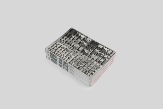
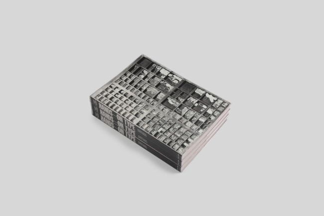
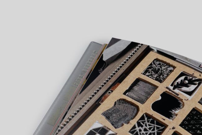
Hands-on Type seeks to explore and reflect on graphic production, the use of moveable types today and the promotion of teaching methodologies based on know-how. From a series of workshops and conferences, a publication will result that builds a parallel narrative between high and low technology in teaching and Design practice. Hands-on Type is promoted by esad–idea, Research in Design and Art and ESAD – College of Art and Design.
The three guests invited the participants to work in a workshop environment, through practice and experimentation. From the composition to the execution of their own prints and printing patterns, participants had the opportunity to explore techniques in proximity with these renowned designers.
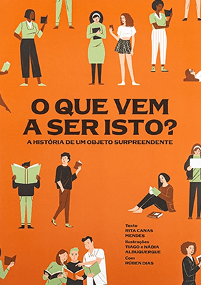
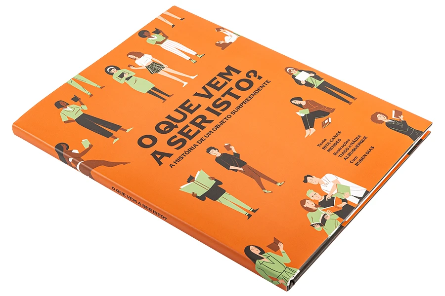
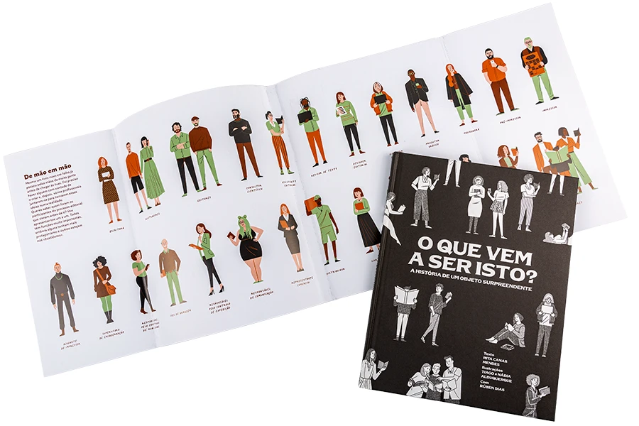
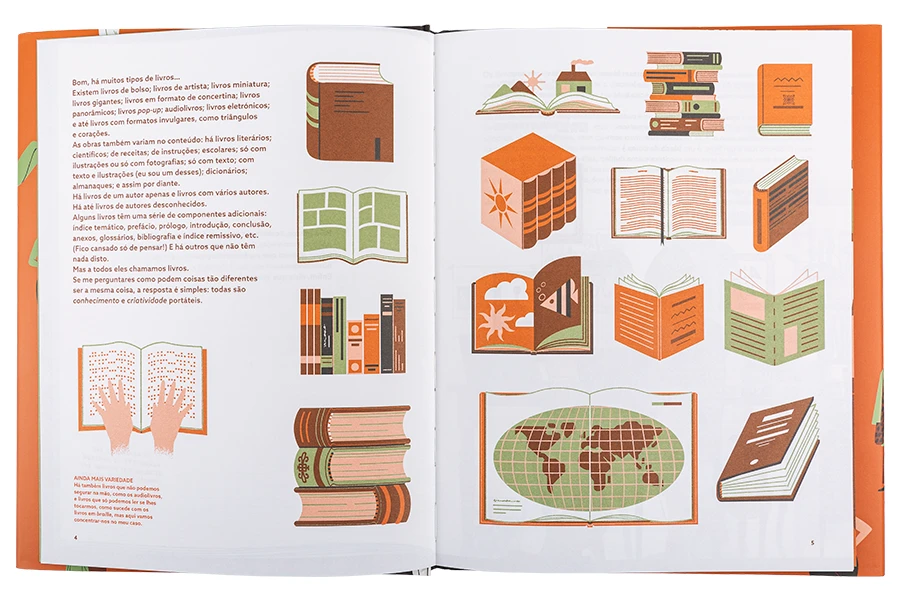
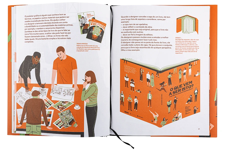
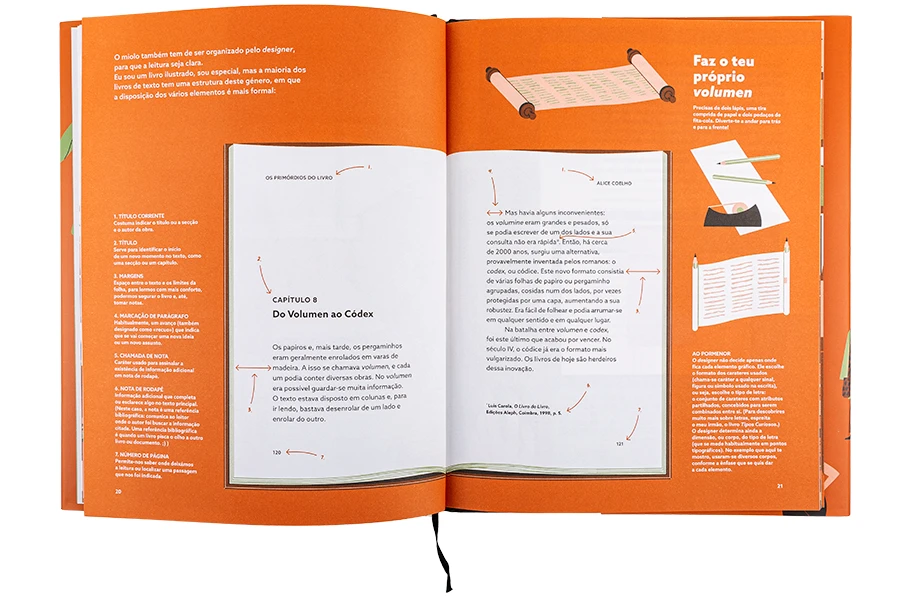
O que vem a ser isto? História de um Objeto Surpreendente
[What is this? History of a Surprising Object]
Co-authored in Rita Canas Mendes and co-illustrated with Tiago e Nádia Albuquerque
This is a story about the people and the processes of making a book. Reveals some inputs about the history of this great object that is a book and explains how it is made today.
It is the result of a partnership between the Portuguese National Press and Pato Lógico, this book brings us a behind-the-scenes look of the book making and which are usually taken for granted. Here we will reveal a series of details some of us had never though a bout.
Although the illustration's registration may seem directed the youngest, it is a very entertaining story that will also interest the older ones, touching the real History and series of subjects around the book as an object.
You can find this book in bookstores across Portugal or in the National Press's online store. In its early release, only in Portuguese, but keep in touch, there is a rumour of possible translations into other languages.
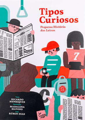
Co-authored with Ricardo Henriques e Ilustração de Madalena Matoso
This book puts the dots in the i's, the serifs in their place, and ink the characters. It tells you a Latin alphabet story and reveals the alphabet's secrets from fonts to typefaces.
The letters K, W and Y, will guide you to learn to distinguish an italic from an Italian and a tail from an ear. There are type founders, designers, a vain fox, a fuzzy bidet, and, hopefully, no typos in between.
The result of a partnership between the Portuguese National Press and Pato Lógico, this book brings us a behind-the-scenes look at the evolution of the letters we use and which are usually taken for granted. Here we will reveal a series of details with some humour, always with an eye in the knowledge of letters and type history.
Although the illustration's registration may seem directed the youngest, it is a very entertaining story that will also interest the older ones, touching the real History and series of subjects around the letters.
You can find this book in bookstores across Portugal or in the National Press's online store. In its early release, only in Portuguese, but keep in touch, there is a rumour of possible translations into the Spanish language.
Originally released in Portuguese, it was translated to Spanish by the Fondo de Cultura Económica Chile. And there is a rumour of translations into other languages. Stay tuned.
Recognitions and Special Mentions
The 2021 Bolonha Children Book Fair attributed it a special mention in the category of non fiction, among 1577 books, from 41 países. The Jury comment: ”A great and chronological book, that brings access to the young readers the complex, but important, still unexplored, theme of typography. As the hypertext is as a way fo written expression, we are taken to reflect on the visual picture of our words“.
This book is available at the itemzero website BUY HERE
Co-Published by Itemzero and Maiadouro
2019
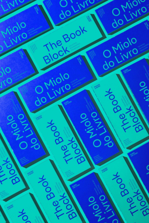
The Book Block [Miolo do Livro]
Industrial Bookbinding Techniques [Técnicas de Encadernação Industrial]
Co-authored with Rui Oliveira, Fábio Duarte Martins and Ricardo Philippe Dantas
This book gathers the most common industrial bookbinding techniques. Presenting how they are made, its characteristics and considerations, that may be helpful to consider when ordering, designing or producing a book. Therefore it is directed to editors, designers and producers related to the book arts.
Thoroughly illustrated, allow a fast access to the multiple concepts for each technique. Therefore as a bilingual edition in Portuguese and english establish for the first time a vocabulary for Portuguese language.
Resulting from partnership of the design studio Itemzero and the book printers and bookbinders Maiadouro it was developed in eight hands, containing the knowledge from the practice of design and production. As a result gathers in a concise and direct language the keen yes of a book designer and the practical experience of a contemporary industrial bookbinder.
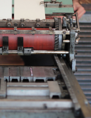
Imprimere – Arte e processo nos 250 anos da Imprensa Nacional
[Imprimere – Art and process in the Portuguese National Printing Office’s 250 years]
Co-Authored with Sofia Meira
Published together with the homonymous exhibition it is more than just a catalogue of the presented pieces. It is an educational tool not only for teachers and students of design but to anyone interested in knowing how books used to be made. It reveals an understanding of the value of the techniques in its current practice and formation, namely in Design education.
In the first part of the book, a series of essays contextualise the design in Portuguese history. Other articles reveal the practice presented in the first person and how the appropriation of the old techniques are resurging in the current design scene.
The second part exposes the techniques of bookmaking, with brief descriptions on the most significative processes and methods. Taking as a guide the Portuguese National Printing Office’s 250 years of book production, it represents a historical approximation of the Portuguese reality. It starts with papermaking and printing type manufacturing; It follows with the most relevant printing methods used for bookmaking: letterpress typography, calcography and lithography in stone and offset; and finishes with bookbinding. The current section is the most extended part of the book, widely illustrated, with a curated collection of machinery, tools and printed materials, exceptionally photographed.
The third and last part of the book contains the reproduction of a collection of ten prints, developed by ten designers, exploring the above techniques in today's practice.
A copy can be obtained in book stores all over Portugal or directly from the editor's Imprensa Nacional Cada da Moeda website. Although the book is only in Portuguese, the extensive collection of great pictures by the photographer Luís Espinheira pocess their great interest by itself.
The book was awarded with a Honoray Mention for the Portuguese Book Design Award 2019, pormoted by DGLAB. And also shortlisted in the Internacional competition from Stiftung Buchkunst for the “Best Book Design from all over the World” 2020.
Imprimere – Arte e Processo nos 250 anos da Imprensa Nacional
[Art and process in the Portuguese National Printing Office’s 250 years]
Co-Curated with Sofia Meira
The exhibition aimed at bringing to a broad audience an early contact with the evolution of bookmaking techniques. Unable to show every possibility we associated with the Portuguese National Printing Office allowing us to focus on their work over the last 250 years.
The techniques allowed us to organise a curated selection of machines, tools and printed materials, widely used in the trade. With a didactic perspective, the aim was to reveal the elemental steps on bookmaking. With a focus on seven techniques, from making paper and type manufacturing to the conventional printing techniques (as typography, calcography, lithography and silkscreen), the visitor was able to get an overall idea of the complexity of these processes.
Hopefully, it contributed to an improvement of the consciousness of the book as an object, regardless of the technology used to make it.
In a moment that designers are rediscovering old methods, to recover this knowledge allowed the community to move on, reclaiming these techniques into contemporary practices.
The exhibition took place at Casa do Design, and was supported by the Matosinhos City Council; esad–idea and the Portuguese National Mint and Printing Office.
Awarded with Certificate of Typographic Excellence from the Type Directors Club
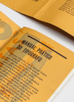
Co-authored with Joana Monteiro
This book was developed with the aim to guide newcomers inside a traditional letterpress workshop. The publication consists of a glossary of essential terms and objects. Brief descriptions of the main phases and necessary materials support a proper understanding for letterpress practice.
It was organised according to the phases of the process, considering a resume of needs to the current letterpress practice for the current beginners. The intention with this object is to promote a general understanding inside the workshop, making easier the learning effort for every interested in getting in touch with letterpress.
Awarded with the “Certificate of Typographic Excellence” from the Type Directors Club, Typography 38. It was shown at the 63rd Awards Exhibition (TDC63) in New York City. The exhibition has toured through cities in the United States, Canada, China, England, France, Germany, Indonesia, Israel, Japan, Poland, Russia, South Korea, Spain, Taiwan, Thailand, and Vietnam.
We are now offering a possibility to buy it, while it still last, but we can only do it only in a simplified mode. We sell it by 30 euros post included, (Paypal only). The shipping we do-it only as we have a group of packs to ship, so please consider it may take some time to receive it. If you are interested send me an e-mail (you can find it in the @ sign at the website right top corner).
In the early years the publication wasn't unavailable for sale, but, you could exchange it with another book, a typographically printed piece or any other type related material. We are compiling each exchange on this Facebook event page. If you are still interested in that possibility, have a look at the previous exchanges and feel free to get in touch.
Tipos das Letras (TdL) is an independent digital type foundry based in Portugal.
Get your stencil here www.tiposdasletras.com
TIPOS DAS LETRAS
05.2013
RUHA Stencil
Co-author Aprígio Morgado e Ricardo Santos
The need to create an educational tool for the teaching of typographic design gave rise to the RUHA project, a stencil designed for the exploration of letterforms that also shares the purpose of the construction of messages.
RUHA evokes the sound and geometric rigidity of a landmark development in the history of typography, the Romain du Roi, a font commissioned by Louis XIV of France and developed by a committee appointed by the Académie des Sciences. While they were contentious because of their prétendues règles, the mechanical form of these fonts paved the way for the Transitional and Didones fonts. The character model presented by RUHA is the result of the synthesis and interpretation of Modern typefaces.
Despite this rigidity, the rationality of the basic model encourages graphic experimentation and creativity. Using the same base the stencil makes it possible to explore Latin, Tuscan, Grotesque and many other styles, and the addition of decorative elements such as diamonds or terminals and other graphic elements is also possible.
The RUHA stencil has several features that set it apart from the conventional stencil concept. The letters are built using elements that are added on to or superimposed upon each other; their form may or may not feature the “cuts” that usually are characteristic of this technique.
A contemporary reinterpretation from a Eighteenth century type
Co-Authored with Fábio Martins
Regem is an ongoing collaborative project that aims to reinterpret a typeface, in four hands and continuously update our discussions online, making a record of the process in blog format as the work is going.
Usually, when doing a revival, the obvious way to acquire references is to look a the display types: they allow to perceive much more details, making it easier to make choices and to transform it into vectors. For this project, the option was to go the other way around: to ignore the display types and look at the smaller ones, filled with artefacts and rough shapes, with not-so-elegant cuts and ink blots.
The choice is to look at these artefacts and reading them as statements, not errors.
Punchcutters were adapting forms to make them work at a given size – and since type was to be seen printed, these “errors” play a crucial role in the texture – while being limited to their tools and physical constraints. Comparing to the process of cutting type in the Eighteenth century, the contemporary digital type design has a baffling degree of precision. Also, printing nowadays is much more refined. Such detail demands a de-rationalisation on what to keep and what to ignore. At the same time, enough room should be allowed in the development of a contemporary interpretation, and to work in four hands will naturally retain a sum of perspectives.
Our goal is to produce a contemporary text typeface, designed to be used around 9-10 points, while rationalizing and documenting the process, discussing how to achieve informed decisions, based on history, balance and technique.
A similar process happens for the italics and the two bolds – the latter that, by that time, were still non-existing, but that is an obvious need in regular contemporary use.
The decisions and solutions will come along the process; the points above, serve as a starting point of a project that is under development. Keep an eye on the developments in here.
Complete RUHA typeface family available. GET IT HERE
TIPOS DAS LETRAS
05.2013
RUHA
Typeface Family
Co-author Aprígio Morgado e Ricardo Santos
RUHA evokes the sound and geometric rigidity of a landmark development in the history of typography, the Romain du Roi, a font commissioned by Louis XIV of France and developed by a committee appointed by the Académie des Sciences. While they were contentious because of their prétendues règles, the mechanical form of these fonts paved the way for the Transitional and Didones fonts. The character model presented by RUHA is the result of the synthesis and interpretation of Modern typefaces.
Despite this rigidity, the rationality of the basic model encourages graphic experimentation and creativity. Using the same base, the stencil makes it possible to explore Latin, Tuscan, Grotesque and many other styles, and the addition of decorative elements such as diamonds or terminals and other graphic elements is also possible.
Taca is a typeface built around "squircles" — neither square nor circle, but something between the two. We usually associate the rounded, convex box with television screens from the 1960s and with Aldo Novarese’s classic typeface, Eurostile. But where Eurostile is cold and machined, Taca Pro is warm and rugged — as if moulded from clay or carved from stone.
Taca Pro’s organic feel is derived from its rounded crotches at right angles, where perpendicular strokes meet. This subtle finish, along with blunt stroke endings, softens the otherwise rigid skeleton.
With such a strong approach, Taca Pro could be relegated to the bin of experimental designs, severely limited in their application. But that fate is usually born of a less experienced maker.
Taca Pro isn't slave to its concept, but a performing font family, effective in various sizes and environments. Its letter shapes break away from the canon whenever legibility is needed, while still maintaining a flavourful design as a whole. If it wasn't enough, a set of squircle-shaped alternates provide the user with the flexibility to get even more formal flavours when the situation calls for it.
Fitting to its functional aims, Taca has many of the features one expects from a proper text font: lining and oldstyle figures, case-sensitive punctuation, and Extended Latin languages support.
The simplicity, openness, and squarishness of Taca’s forms also make it an ideal for the pixel grid of screen displays.
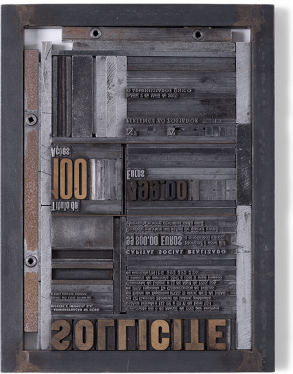
Tipografia Dias is a movable type letterpress workshop founded in 2000, run by Designers, designing with movable type. www.tipografiadias.com
Design with Movable Type
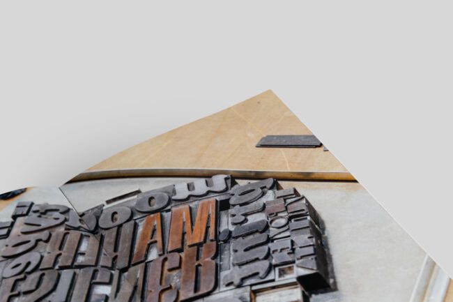
At Tipografia Dias we have been developing projects such as books, posters, business cards or postcards, among others. We create the project from the conception of the idea through the design process working with movable type, up to printing. Containing over 150 typefaces of wood and metal we have been able to produce a wide variety of solutions.
Taking advantage of the old technique of letterpress, we are allowed to control the process thoroughly. Moreover, this technique empowers us to make particular objects, where every print is unlikely different.
In 2019 the book Fiapo, entirely designed and printed in letterpress was awarded an honorary mention on the Portuguese Book Design Award by its peculiar design qualities and details. The same book was shortlisted in the Internacional competition from Stiftung Buchkunst for the “Best Book Design from all over the World” 2019.
Tipografia Dias is a movable type letterpress workshop founded in 2000, run by Designers, designing with movable type. www.tipografiadias.com
Letterpress Workshops
In a letterpress workshop, one can learn a lot about type and typography. All bases of how we use letters today on our computers result from the evolution of the old technique of movable type.
Contact us to organize a workshop for you, a group, or your company, either in Lisbon or Porto. I have performed workshops since 2006 either at ar.co in Lisboa, at esad in Matosinhos or with my studio, currently in Espinho.
You can learn how it works, gaining conscience of how to handle type and the space that surrounds it which is the basics of every typographic composition. These concepts remain nearly the same since Gutenberg. They organize the content in order to make them clear. You can get out of the computer and try an alternative technology and get your hands dirty with ink. Get in touch.
Founded in 2004, Item Zero is a Multidisciplinary studio, designing content-based solutions for print and media, but essentially we make books. itemzero.com
Book design
From the idea to production
We make books, from a catalogue to literature, from reports to illustrated books. With a focus on making the content clear, we develop projects as an open discussion with the author. Working with specialised photographers or illustrators, we aim to produce unique and outstanding objects. Looking carefully from the selection of the raw materials to the best production techniques. We work with renowned printers and strive to elevate the book experience to the highest standard.
The book Fiapo was awarded an honorary mention on the Portuguese Book Design Award 2018. The same book was shortlisted within 600 entries, from 36 countries, in the Internacional competition from Stiftung Buchkunst for the “Best Book Design from all over the World” 2019.
—
Anyone who loves books knows no picture can capture a good book in its entirety. The different touches of the papers, the feeling of using a book that easily opens flat, are the kind of details that only by handling the book one can understand.
If you are interested in making a book with us, get in touch.